What's New in SquaredUp DS Standalone
See also: Release Notes for SquaredUp DS Standalone
What's new in v6.4
SquaredUp DS Standalone v6.4 includes the following new features:
- Message broadcasting system (SQ-5138)
- Ability to add a new tile above another (SQ-4108)
- PowerShell 7.4.6 upgrade needs .NET Core 8.0 (SQ-5323)
Message broadcasting system
Broadcast allows you to display a message at the top of all dashboards which will be seen by any active users. This enables you to easily notify users of any updates or known issues, such as planned or even unplanned system outages.
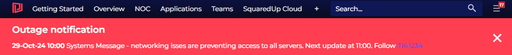
For more information see Broadcast
Ability to add a new tile above another
It is now possible to add a tile above another, rather than just adding a full new row above. Previously, when editing a row of tiles that had multiple columns you could add new tiles to the left of, right of and below a tile, but there was no way to insert a new tile above it.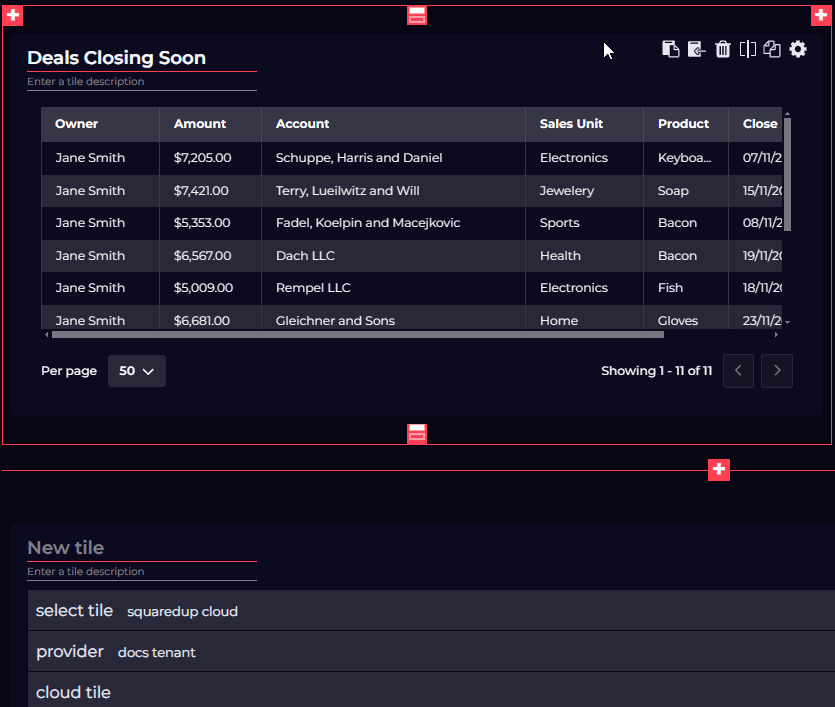
PowerShell 7.4.6 upgrade needs .NET Core 8.0
PowerShell 7.2 reaches an end of support in November 2024, so we've upgraded to PowerShell 7.4.6. If you choose to use .NET Core in your PowerShell tiles you will need to install .NET Core 8.0.
Download now & more information
To get started see How to install SquaredUp DS Standalone using the installer
Get the latest version of SquaredUp DS Standalone
Read the Release Notes for SquaredUp DS Standalone for details on other improvements in this release.
If you have an earlier version of DS Standalone already installed, then the installer will upgrade your installation, see How to upgrade SquaredUp DS Standalone
What's New in v6.3
SquaredUp DS Standalone v6.3 includes the following new features:
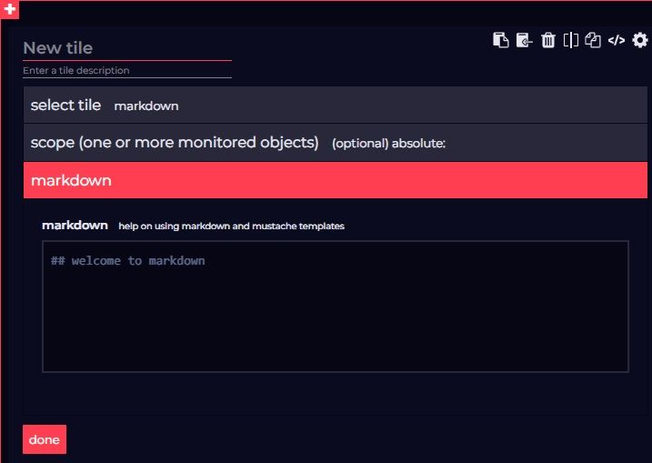
- New Markdown tile
- Tear-off tiles
New Markdown tile
A new Markdown tile has been added which allows you to add richer content to your dashboards such as links, lists, images and more! You can add Markdown tiles to any dashboard or perspective.
The tile supports "basic" Markdown syntax, see the Markdown guide for reference.
Select the Markdown icon to start configuring the tile.[Image]To configure the tile, simply enter or paste your markdown into the markdown field. For examples see Markdown tile.
Tear-off tiles
You can now click the new Copy an Open Access URL button for an individual tile (that has open access enabled) and then render that tile in the browser when the URL is visited. The URL can also be pasted into the URL field of the Edit embed tile window to render that tile elsewhere in the application.
Additionally, this feature allows URLs for individual tiles to be copied and pasted into iframe tiles or similar in SquaredUp Cloud or some other custom intranet application.
Limitations for this feature are as follows:
- Tiles accessed by a URL will not work if open access is disabled on the parent dashboard. They will start working again if it is re-enabled.
- Tiles URLs will no longer be valid if the tile on the parent dashboard is modified - a new URL needs to be copied in this case.
- Tiles do not update themselves in the background.
- Pinned Perspectives in open access mode do not support this feature.
What's New in v6.2
SquaredUp DS Standalone v6.2 includes the following new features:
- Tile fullscreen mode
- Ability to rename providers
Tile fullscreen mode
You can now view tiles in fullscreen mode by clicking the new Full-screen view button, which is displayed when hovering on a tile.
Clicking this button opens a copy of the tile in a larger window, providing you with a clearer sized view of an otherwise small tile area.
As fullscreen mode displays a copy of the tile, settings such as sorted headers do not persist when opening or closing the view.
To exit fullscreen mode, do one of the following:
- Click the Close button in the top-right of the window.
- Press the ESC key
- Press the TAB + ENTER keys.
Export tile data
Additionally, a new Export to Excel button has been added to the top-right of the fullscreen mode window for supported tiles. Click this button to export the data for the expanded tile to a Microsoft Excel document.
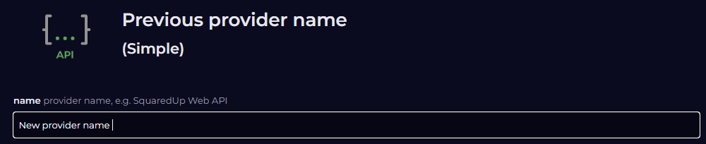
Rename providers
Providers contain the connection details to external platforms and are maintained in ☰ > system > Integrations.
Previously, if you wanted to rename a provider it had to be deleted and then a new one had to be created with a new name.
Now, you can rename a provider by simply selecting it on the Integrations page and editing the name field.
What's New in v6.1
SquaredUp DS Standalone v6.1 includes the following new features:
- 24-hour time format option
- Trend lines in time-series graphs
- EAM-X alert description improvements
- Undo/redo for draft dashboard editing
- Performance drill-down page improvements
- Many more improvements
24 hour time format option
Previously, times were only displayed using a 12 hour clock format (for example, 9AM, 12PM, 1PM etc.). Now, you can choose to display times across the application in a 24 hour format (for example, 9:00, 21:00, 13:00 etc.), giving you greater flexibility in how you present your data.
Trend lines in time-series graphs
You now have the ability to display trend lines in time-series graphs across the application, enhancing your ability to analyze changes across your data. This feature can be toggled at tile-level on the display panel in the tile's configuration settings.
EAM-X alert description improvements
Alert descriptions have been improved to give the customer more context on what has gone wrong, without always needing to drill into SquaredUp DS Standalone cloud to see more (for example, alerts can now pass through the actual error messages and information on breached thresholds).
Undo / redo option when editing dashboard drafts
Undo / Redo buttons have been added to the dashboard edit view. Whenever you make a change, you can now use these buttons to step back and forward through the changes you make.
Performance drill-down page improvements
The Performance tile drill down view also benefits from the enhancements brought by the addition of Trend lines in time-series graphs. If enabled at the tile-level, trend lines are shown on the drill down. Trend lines can now also be toggled locally from within the drill down via the new Trends option in the Settings panel, however this option is not persisted when leaving the drill down view.
Similarly, you can now also select to display horizontal lines across your graphs to now the maximum, minimum, and average values for that data. These lines can be toggled via the new max, min and avg options.
New Data Rangeoptions have also been added to the Settings panel of the drill down, which let you refine the y axis of the graph for each drill down session. As with the newTrends option, this setting is local to the drill down view and is not persistent.
Additionally, where previously selecting the CUSTOM time-series option would display the custom time field under the ribbon and push the graph down, this field now appears adjacent to the CUSTOMoption when selected so that the graph is not disturbed.
Auditing improvements
The auditing feature has been enhanced with the following features that improve the user experience:
- You now have the ability to filter folders.
- You can now filter on multiple types of event at the same time (for example, Dashboard moved + Team Folders modified).
- Previously, you had to scope via the filter pane before any results displayed. Now, auditing events from the last 24 hours now loaded by default.
Scalar tile text alignment
An Alignment option has been added to the Scalar tile settings, allowing you to select whether you want the scalar text to be left-aligned, centered or right-aligned.
Number formatting options
Previously, only the "Si units" number format was supported. Now, decimal number format support has been added for small units and separator format support has been added for large units.
This enhancement allows you to present metrics very common to infrastructure monitoring in a familiar format. For example, without the separation feature for large numbers a disk space value of 74200mb was displayed as 7.42k - which made little sense to an infrastructure engineer.
- VADA: performance improvements in Analyze mode
- Initial page size / speed load improvements
See
What's New in v6.0
SquaredUp DS Standalone v6.0 includes the following new features:
- Date Heatmap: add aggregation options for Web API, SQL and PowerShell tiles
- SquaredUp Cloud aligned color pallet and styling
- New Column Graph visualization: Time series data as bar graphs
See Release Notes for SquaredUp DS Standalone
Older versions
What's New in SquaredUp DS Standalone v5