The Azure Log Analytics tile allows you to query Log Analytics data from Azure Monitorand display that information as part of your SquaredUp DS dashboard.
The Azure Log Analytics tile queries Log Analytics using the query language (KQL).
The ability to render information as a graph is a feature of the Azure portal rather than the Log Analytics Query language itself. Graphs will only be shown if you have selected a suitable graph tile such as the Log Analytics Line Graph or Log Analytics Donut.
You need to have an Azure Log Analytics provider before you can configure an Azure Log Analytics tile. If you haven't created a provider yet, see How to add an Azure Log Analytics provider.
Add a new tile to a dashboard and click on Integrations > Azure.
Choose the visualization for your Azure Log Analytics tile:
A Scalar displays one value. A Scalar is useful to show a specific number like "total cost of my services" or "free disk space on this server". When a Data Stream returns multiple values (meaning a table with multiple rows), you will still be able to pick the Scalar visualization, but the Scalar will only show the value of the first row.
Example:
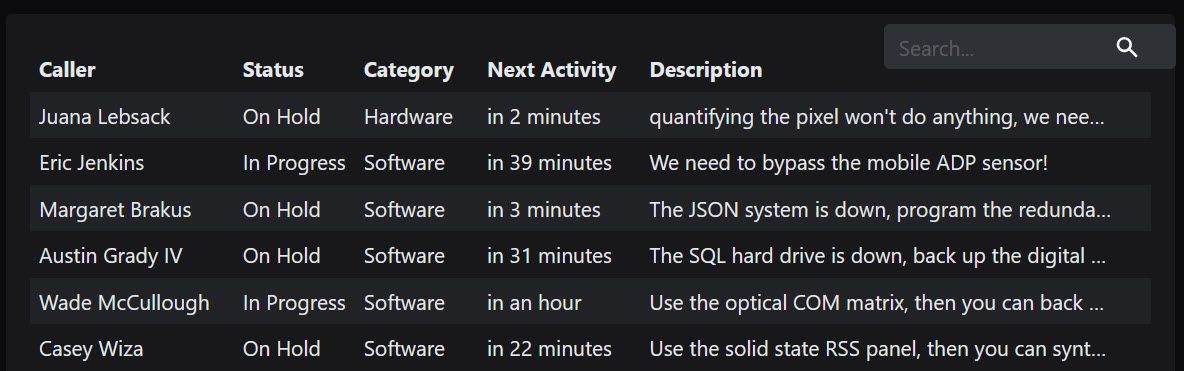
A table of data, for example incidents or tickets.
Tip: You can turn the individual rows into links in the settings. For example, if you're displaying tickets in your grid, you can link the rows to the ticket in your external ticket system.
Did you know? Since SquaredUp DS 5.4 users can search the grid, and temporarily change the column size and sorting of the grid (by clicking on the column headers) without having to access the settings. They can also expand a row by clicking on the three dots at the end of each row if cells are too small to show their entire content.
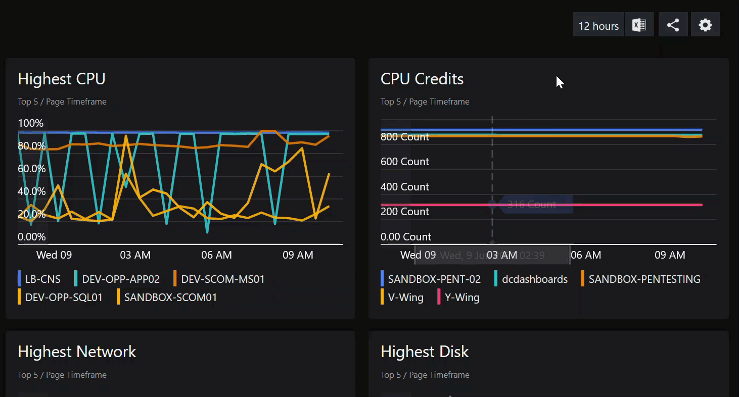
Shows time-series data over time, in a graph with an x-axis (time) and a y-axis. You can show several objects, such as servers, in one graph.
Example:
Visualizes time-series data as vertical columns.
Example:
Visualizes both a number and the resulting bar width based on the number value.
Example:
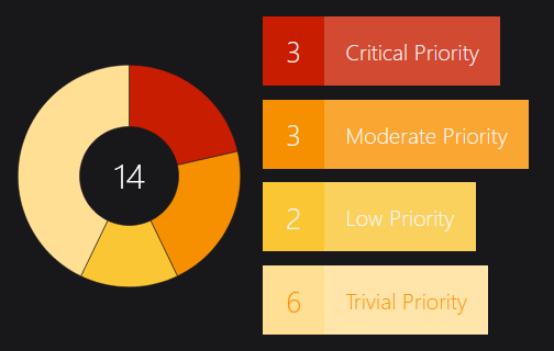
Shows the results in a donut shape.
Example:
Shows the state of items as icons with different colors. You can display just the icons or together with a description. You can also use a background image and drag the icons into position on the image.
Example:
Shows the state of items as blocks with different colors.
Example:
Provider: A provider defines the Log Analytics workspace that you wish to query. Select a provider from the drop-down list. If you haven't created a provider yet, see How to add an Azure Log Analytics provider.
Query: Test your query in the Log Analytics workspace in the Azure portal to be sure it returns the results expected. You can find many sample queries in this area of the portal. Copy and paste the tested query into the Azure Log Analytics tile query box.
The tile uses the query language KQL ("Kusto"). KQL is very rich and offers features such as sorting, projection and calculated values, which you can use to control the display of data in your dashboard.
You can use the clock insert time value button to insert page timeframe and date variables in your query.
Read about the timeframe panel below to see how a timeframe in the query interacts with the timeframe panel in the tile.
Check out our GitHub Samples repository for sample KQL queries from the community that can be used in Azure tiles.
For more information about writing KQL queries see this external Microsoft article.
Your query must return a single figure.
The return data must include a state column which must contain the following values:
healthy, critical, and/or warning (the values are not case-sensitive). Any other values will result in state unknown.
The state values define the color of the status icons or blocks:
Healthy
green
Warning
yellow
Critical
red
Unknown
gray
Your query must return as a minimum a DateTime field and a Numeric value field.
Column Overrides
Here you define how the returned data is displayed. Use the dropdowns to specify which data/column you want to use:
timestamp
Here you define the time series to be used for the visualization.
value
Here you define which value the graph will show. For example, if you want to see the response time of different servers, your metric value would be response time. If you want to see the number of tickets, your metric value would be number (of tickets).
show all: If there are multiple values, you can display these by ticking this box. Each value will get its own series (a line in a line graph, a bar in a bar graph etc.).
grouping
Here you can define a group to take a closer look at the graph's value(s). Each item in the group will create its own series (a line in a line graph, a bar in a bar graph etc.). For example, if you group the value response time by servers on a line graph, you'll see one line per server, each line showing you the response time for this one server over time.
Your query must return a numeric field for the value and a string for grouping.
You can choose to sort or not sort the results using the KQL query, for example:
| top 5 by max_counterValue asc
Column Overrides
Here you define how the returned data is displayed. Use the dropdowns to specify which data/column you want to use:
value
Here you define which value the graph will show. For example, if you want to see the response time of different servers, your metric value would be response time. If you want to see the number of tickets, your metric value would be number (of tickets).
Only for Bar Graphs:
show all: If there are multiple values, you can display these by ticking this box. Each value will get its own series (a line in a line graph, a bar in a bar graph etc.).
grouping
Here you can define a group to take a closer look at the graph's value(s). Each item in the group will create its own series (a line in a line graph, a bar in a bar graph etc.). For example, if you group the value response time by servers on a line graph, you'll see one line per server, each line showing you the response time for this one server over time.
Your query must return a numeric field for the value and a string for grouping.
Queries for donuts should return a maximum of 10 categories. This can be achieved by using the top or limit operators in your query.
Column Overrides
Here you define how the returned data is displayed. Use the dropdowns to specify which data/column you want to use:
value
Here you define which value the graph will show. For example, if you want to see the response time of different servers, your metric value would be response time. If you want to see the number of tickets, your metric value would be number (of tickets).
Only for Bar Graphs:
show all: If there are multiple values, you can display these by ticking this box. Each value will get its own series (a line in a line graph, a bar in a bar graph etc.).
grouping
Here you can define a group to take a closer look at the graph's value(s). Each item in the group will create its own series (a line in a line graph, a bar in a bar graph etc.). For example, if you group the value response time by servers on a line graph, you'll see one line per server, each line showing you the response time for this one server over time.
The Azure API allows you to send a query to multiple workspaces (for Log Analytics) or applications (for App Insights) simultaneously using implicit and explicit cross-resource unions. The Log Analytics and the App Insights tile support both mechanisms, with implicit being easier but explicit offering more control over how data is returned.
Regardless of which mechanism you use, you may only query across 10 apps (for App Insights) or 10 workspaces (for Log Analytics) with a single cross-resource query (and therefore a single tile), and the provider's configured app is always used.
Using implicit Unions
When you use implicit unions, you provide a query to the tile and specify up to 9 other additional workspace/app identifiers. The query is automatically sent to the provider's configured workspace and any others you specify, and the output joined together in a single result for further processing. To configure an implicit cross-resource query:
For Azure Log Analytics tiles: In the query panel click add under additional workspaces. For Azure App Insights tiles: In the query panel click add under additional applications.
Enter an identifier for your workspace/app (using any of the formats given below) and press enter or deselect the text box.
Either repeat the process by clicking add again and adding additional workspaces/apps, or click next and continue to configure the tile.
Using explicit Unions
In contrast to implicit unions, explicit ones are specified directly within your query using the Union statement, and allow you to pull in a specific subset of the data in the other workspaces/apps. For further information check out this Azure blog post on Querying across resources.
For Azure Log Analytics tiles: The example below shows results from the provider's workspace, along with only security updates from another named contosoretail:
union Update, (workspace("contosoretail").Update | where Classification == "Security Updates" )
| where TimeGenerated >= ago(1h)
| where UpdateState == "Needed"| summarize dcount(Computer) by Classification
For Azure App Insights tiles: The example below shows results from the provider's app, along with only GET request exceptions from another named contosoretail:
union exceptions, (app("contosoretail").exceptions |where operation_Name contains "GET" )
| summarize count() by problemId
Identifiers for workspaces
The following methods are supported to identify your workspace/app:
Resource name
The human readable name of the resource.
Note: If used this must be unique to all Azure subscriptions the provider has access to or the query will fail as ambiguous.
Qualified name
The "full name" of the workspace, in the following format:
For Azure Log Analytics: <subscriptionName>/<resourceGroup>/<workspaceName>
For Azure App Insights: <subscriptionName>/<resourceGroup>/<applicationName>
Note: The qualified name may still be ambiguous as subscription names are not unique, but it is extremely unlikely.
GUID
The GUID (e.g. b438b4f6-912a-46d5-9cb1-b44069212ab4), which is completely unique and unambiguous.
For Azure Log Analytics: The GUID is the Workspace ID
For Azure App Insights: The GUID is the Application ID
For Azure App Insights: /subscriptions/<subscriptionId>/resourcegroups/<resourceGroup>/providers/microsoft.operationalinsights/applications/<applicationName>
Note: While the string is unambiguous, it is also extremely long and difficult to work with.
Timeframe:
Here you determine the timeframe for the search query.
The default timeframe is 24 hours, which means the tile will not return any entries older than 24 hours.
Take care when using a long timeframe, as this may pull many thousands of entries and significantly impact browser performance.
If your query doesn't specify a timeframe
Set the time range to the fixed time range you want to use.
If your query specifies a timeframe
If you specify a timeframe in the query (e.g. where timestamp >= ago(2h)), events must satisfy both the timeframe you set here and in the where clause in your query.
If you want to control the timeframe using only the query, set the tile timeframe to time range > all.
Note:
This tile always ignores the dynamic page timeframe set by users.
The page timeframe is the timeframe setting a dashboard is currently using. These timeframes are all relative to the current time, for example 7 days ago until now. When a user changes the page timeframe, all tiles that have use page timeframe set will adapt to the new timeframe. (Tiles that do not have use page timeframe set (i.e. are set to specific timeframe or custom timeframe) are not affected and won't change.)
The custom option can be used to set timeframes using ISO 8601 format
SquaredUp DS does not support the week notation.
Configure the settings for your visualization:
Scalar
Font size
Allows you to set the font size of the value in the tile.
Alignment
Select the scalar text alignment. Choose from left, center or right.
Unit
Allows you to add a unit to the value displayed in the Scalar tile. For example, if your value shows a time in milliseconds, you can enter "ms" or if your value shows pageviews, you can enter "pageviews".
Value formatter
Allows you to format the value by using the mustache picker. For example, you can round the value up or down or convert it.
Color
Conditional formatting:
You can display the data in different colors based on values you define here. For example, you can display the data in green when the value is below 100 and in red when it is above 100.
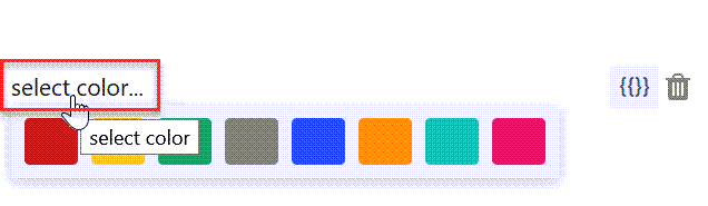
Click on add to configure a condition.
Click on select color.... to open the color picker. Select the color for this condition.
Enter your condition in the field next to the color. You can use the value property and manipulate it with JavaScript String and Regex APIs. When you click on the mustache picker, you'll get some examples:
Value is greater than something, less than something, etc. For example: {{value < 10}} (The color you pick will be used if the value is less than 10)
Value is present in the result (scalar tiles only) For example: value.IndexOf('error') != -1 (The color you pick will be used if the string value "error" is present in the results)
Value matches one of the regular expressions you defined (scalar tiles only) For example: value.match(/healthy|good|up/) (The color you picked will be used if the string values are healthy, good, or up)
Display:
Here you decide how the color is used:
Tile background
Highlight the tile in the color you defined.
Text foreground
Display the text in the color you defined.
Link options
Allows you to turn the graph item(s) into links. You can either enter plain text to create a fixed link (URL always stays the same) or use dynamic properties to create a dynamic link.
Dynamic links make use of dynamic properties which are inserted as part of the URL. This creates a template URL that will be resolved to an actual URL based on the items properties.
For example, if you want to link to tickets in your ticket system and the format of the URL for tickets in your system is https://www.my-system/ticket-123, where 123 is the ticket ID, you can use the dynamic property that contains the ticket ID and enter the dynamic URL https://www.my-system/ticket-{{ticketID}}.
For scalars, you can only use the dynamic property value in dynamic links, which means the link changes when the value of the scalar changes. Since a scalar is just one item, it would also make sense to use a fixed link, for example the link to the website of which you are displaying the response time.
For status icon or bars and the rows of a grid, you usually want to use a dynamic link since you get multiple items or rows that represent different things. You can use any of the dynamic properties the mustache picker offers you.
Dynamic mustache properties and values you need to change according to your instance are highlighted in bold.
You can choose between showing or hiding the header for all columns.
Expand rows automatically
Activate this checkbox if you want the row height to expand automatically based on the row content, for example if your grid uses increased text size, images, emojis etc.
Limit number of results displayed
You can set a limit of the initial number of results displayed in the grid. If you have set a limit and there are more results to display, users will see a "show all" button below the grid.
Font size
Use the slider to adjust the font size.
Tip for column sizing: You can change the column width directly in the grid by clicking on the divider lines between columns and dragging them to the width you want. You need to show column headers (by activating the show column headers check box) to be able to change the column width. Resizing columns while in edit mode affects how the grid looks by default when users open the dashboard. Users can temporarily change the column sizes by dragging them, but those changes only last until they leave the page.
Threshold
You can choose to apply a threshold line at a specified value, and whether you wish to fill above or below this value, or just show the line. For example, for free disk space you might want to fill below the line to highlight when space goes below a particular threshold. For processor information you might want to fill above the line to highlight when processor percentage goes above that threshold. The threshold is also shown on the drilldown view.
Max, min, avg
When drilled-down to view a graph, you can select the min, max and avgoptions for each object (displayed to the right of the graph), which displays a line cutting horizontally across the graph a each of the selected value points.
Data range
The Data Range option allows you to choose the range of data the graph will display. For line graphs, this means the data on the y-axis.
percentage
Shows 0 to 100
fit to data
Shows the data minimum to data maximum
fit to data (from zero)
Shows from 0 to the data maximum
custom
Allows you to specify the min and max
custom fit
Allows you to specify the min and max limits, so that data outside your settings will not be shown. If all the data falls within your specified ranges then the y-axis range will fit to the data rather than your caps.
Display
Height:
Allows you to set the height of the tile with a slider.
Show hover details:
Shows the value for all lines at any point you hover. There may not be a value exactly where you hover so the value is interpolated from the values either side.
Show points:
Shows where the data points are on the line. Useful to identify missing points, or detail for changing data.
Show trend
Enable the Show Trend Linestoggle to display a trend line for the line graph data. Disable the toggle to hide the trend line.
Custom colors:
You can display the data in different colors based on labels. For example, you can display data in green for a specific user.
Click on select color.... to open the color picker. Select the color for this condition.
Enter your condition in the field next to the color. You can use the label property and manipulate it with JavaScript String and Regex APIs. When you click on the mustache picker, you'll get some examples:
Condition is true if the label contains something For example: {{label.indexOf('SQL') != -1}} (The color you pick will be used if the label contains 'SQL')
Condition is true if the label contains multiple things For example: {{label.match(/C:|D:|E:/) != null}} (The color you pick will be used if the label contains 'C:', 'D:' or 'E:')
Condition is true if the label contains multiple things with multiple variations For example: {{label.match(/^[Ss]erver[0-9]+$/) != null}} (The color you pick will be used if the label is 'Server' or 'server' with a number after it)
Label
Allows you to change the label of the results.
Show legend:
Allows you to show or hide the legend of the graph.
Label:
auto
Choose this option if you want to use the default label that has been created automatically.
custom
Here you can change the label to a custom label. You can use static text and dynamic properties. Use the mustache picker to select dynamic properties from the response data to use them as labels.
Property names that contain hyphens (for example properties.name-with-hyphens) can't be processed due to a JavaScript limitation. If you want to use a property that contains a hyphen, you have two options:
If you have access to the data source and can change the name of the property, change the name of the property to a name without hyphens. For example, if your Elasticsearch query uses a property (an aggregation, a grouping or any other property you want to use) with a name that contains a hyphen, you can either access your Elasticsearch instance and change the name there or you can overwrite the name in the query dsl field.
If you can't change the name of the property, you need to enter the property name in the following format: Original property name: {{properties.name-with-hyphens.value}} New format: {{properties['name-with-hyphens'].value}}
Threshold
You can choose to apply a threshold line at a specified value, and whether you wish to fill above or below this value, or just show the line. For example, for free disk space you might want to fill below the line to highlight when space goes below a particular threshold. For processor information you might want to fill above the line to highlight when processor percentage goes above that threshold. The threshold is also shown on the drilldown view.
Data range
The Data Range option allows you to choose the range of data the graph will display. For line graphs, this means the data on the y-axis.
percentage
Shows 0 to 100
fit to data
Shows the data minimum to data maximum
fit to data (from zero)
Shows from 0 to the data maximum
custom
Allows you to specify the min and max
custom fit
Allows you to specify the min and max limits, so that data outside your settings will not be shown. If all the data falls within your specified ranges then the y-axis range will fit to the data rather than your caps.
Display
Height:
Allows you to set the height of the tile with a slider.
Show hover details:
Shows the value for all lines at any point you hover. There may not be a value exactly where you hover so the value is interpolated from the values either side.
Solid bars:
Show the bars as solid color or translucent.
Custom colors:
You can display the data in different colors based on labels. For example, you can display data in green for a specific user.
Click on select color.... to open the color picker. Select the color for this condition.
Enter your condition in the field next to the color. You can use the label property and manipulate it with JavaScript String and Regex APIs. When you click on the mustache picker, you'll get some examples:
Condition is true if the label contains something For example: {{label.indexOf('SQL') != -1}} (The color you pick will be used if the label contains 'SQL')
Condition is true if the label contains multiple things For example: {{label.match(/C:|D:|E:/) != null}} (The color you pick will be used if the label contains 'C:', 'D:' or 'E:')
Condition is true if the label contains multiple things with multiple variations For example: {{label.match(/^[Ss]erver[0-9]+$/) != null}} (The color you pick will be used if the label is 'Server' or 'server' with a number after it)
Label
Allows you to change the label of the results.
Show legend:
Allows you to show or hide the legend of the graph.
Label:
auto
Choose this option if you want to use the default label that has been created automatically.
custom
Here you can change the label to a custom label. You can use static text and dynamic properties. Use the mustache picker to select dynamic properties from the response data to use them as labels.
Property names that contain hyphens (for example properties.name-with-hyphens) can't be processed due to a JavaScript limitation. If you want to use a property that contains a hyphen, you have two options:
If you have access to the data source and can change the name of the property, change the name of the property to a name without hyphens. For example, if your Elasticsearch query uses a property (an aggregation, a grouping or any other property you want to use) with a name that contains a hyphen, you can either access your Elasticsearch instance and change the name there or you can overwrite the name in the query dsl field.
If you can't change the name of the property, you need to enter the property name in the following format: Original property name: {{properties.name-with-hyphens.value}} New format: {{properties['name-with-hyphens'].value}}
Data Range
The Data Range option allows you to choose the range of data the graph will display. For line graphs, this means the data on the y-axis.
percentage
Shows 0 to 100
fit to data
Shows the data minimum to data maximum
fit to data (from zero)
Shows from 0 to the data maximum
custom
Allows you to specify the min and max
custom fit
Allows you to specify the min and max limits, so that data outside your settings will not be shown. If all the data falls within your specified ranges then the y-axis range will fit to the data rather than your caps.
Value
Value formatter
Allows you to format the value by using the mustache picker. For example, you can round the value up or down or convert it.
Label
Allows you to change the label of the results.
auto
Choose this option if you want to use the default label that has been created automatically.
custom
Here you can change the label to a custom label. You can use static text and dynamic properties. Use the mustache picker to select dynamic properties from the response data to use them as labels.
Property names that contain hyphens (for example properties.name-with-hyphens) can't be processed due to a JavaScript limitation. If you want to use a property that contains a hyphen, you have two options:
If you have access to the data source and can change the name of the property, change the name of the property to a name without hyphens. For example, if your Elasticsearch query uses a property (an aggregation, a grouping or any other property you want to use) with a name that contains a hyphen, you can either access your Elasticsearch instance and change the name there or you can overwrite the name in the query dsl field.
If you can't change the name of the property, you need to enter the property name in the following format: Original property name: {{properties.name-with-hyphens.value}} New format: {{properties['name-with-hyphens'].value}}
Display
Vertical:
Tick this option to show vertical bars, otherwise horizontal bars are shown.
Bar width:
Allows you to set the width of the bars with a slider.
Color
multiple colors
Here you can enable or disable graph color matching.
If you turn color matching on, one item (a specific resource, object, site, anything you are displaying in your graphs) is shown in the same color in different graphs on one dashboard. You can use either color matching or custom colors (colors based on values), they cannot both be used at the same time.
custom colors
Setting colors based on values
You can display the data in different colors based on values you define here. For example, you can display the data in green when the value is below 100 and in red when it is above 100.
Click on add to configure a condition.
Click on select color.... to open the color picker. Select the color for this condition.
Enter your condition in the field next to the color. You can use the value property and manipulate it with JavaScript String and Regex APIs. When you click on the mustache picker, you'll get some examples:
Value is greater than something, less than something, etc. For example: {{value < 10}} (The color you pick will be used if the value is less than 10)
Value is present in the result (scalar tiles only) For example: value.IndexOf('error') != -1 (The color you pick will be used if the string value "error" is present in the results)
Value matches one of the regular expressions you defined (scalar tiles only) For example: value.match(/healthy|good|up/) (The color you picked will be used if the string values are healthy, good, or up)
You are able to combine value matching with label matching.
Setting colors based on labels
You can display the data in different colors based on labels. For example, you can display data in green for a specific user.
Click on select color.... to open the color picker. Select the color for this condition.
Enter your condition in the field next to the color. You can use the label property and manipulate it with JavaScript String and Regex APIs. When you click on the mustache picker, you'll get some examples:
Condition is true if the label contains something For example: {{label.indexOf('SQL') != -1}} (The color you pick will be used if the label contains 'SQL')
Condition is true if the label contains multiple things For example: {{label.match(/C:|D:|E:/) != null}} (The color you pick will be used if the label contains 'C:', 'D:' or 'E:')
Condition is true if the label contains multiple things with multiple variations For example: {{label.match(/^[Ss]erver[0-9]+$/) != null}} (The color you pick will be used if the label is 'Server' or 'server' with a number after it)
You are able to combine label matching with value matching.
Sort
Sort allows you to change the order of the results displayed. You can sort by value (ascending or descending) or label (alphabetically ascending or descending).
Value formatter
Allows you to format the value by using the mustache picker. For example, you can round the value up or down or convert it.
Display
Size mode:
Default
Displays the donut scaled to the height of the tile.
Fill
Enlarges the donut to use the whole width of the tile. If you chose the fill option and show the legend, you can define the size of the legend with a slider.
Show legend:
Allows you to show or hide the legend of the graph.
Table or Inline:
Show the legend as a separate table or as labels pointing to the segments. When using Inline you can also hide the segment values, and use the slider to change the size of the labels.
Show zero values in legend:
Will show legend items for values of zero which are otherwise missing from the donut.
Fixed height scrollable legend:
Sets the legend to a fixed height where you can scroll through the items. This means that the tile doesn't become too large if there are many items.
Display mode:
Allows you to switch between displaying absolute values or percentages.
Color palette:
Here you can choose between different color palettes.
Note: If there are more items than colors, the colors repeat from the beginning.
Tip for displaying priorities or health states: If you want to display priorities or health states from a data source that doesn't enrich the data with information about priority or health (like the SQL tile or external APIs), use the custom color option and map the results to the correct color. This way, you can make sure that healthy or low priority results are displayed in green, unhealthy or high priority results are displayed in red, etc. If you use the color palettes Priorities, Health1, or Health2 the colors get assigned depending on how the results are sorted, which doesn't guarantee that the colors make sense for the priority or state they represent.
General
10 different colors without specific meaning
Priorities
5 different colors representing 5 different priority states
Health1
3 different colors representing 3 different health states (red=unhealthy, green=healthy, gray=unknown)
Health2
4 different colors representing 4 different health states (red=critical, orange=unhealthy, green=healthy, gray=unknown)
Pastel
10 different pastel colors without specific meaning
Blue
4 different shades of blue from dark to light
Orange
4 different shades of orange from dark to light
Green
4 different shades of green from dark to light
Pink
4 different shades of pink from dark to light
Custom
Setting colors based on values
You can display the data in different colors based on values you define here. For example, you can display the data in green when the value is below 100 and in red when it is above 100.
Click on add to configure a condition.
Click on select color.... to open the color picker. Select the color for this condition.
Enter your condition in the field next to the color. You can use the value property and manipulate it with JavaScript String and Regex APIs. When you click on the mustache picker, you'll get some examples:
Value is greater than something, less than something, etc. For example: {{value < 10}} (The color you pick will be used if the value is less than 10)
Value is present in the result (scalar tiles only) For example: value.IndexOf('error') != -1 (The color you pick will be used if the string value "error" is present in the results)
Value matches one of the regular expressions you defined (scalar tiles only) For example: value.match(/healthy|good|up/) (The color you picked will be used if the string values are healthy, good, or up)
You are able to combine value matching with label matching.
Setting colors based on labels
You can display the data in different colors based on labels. For example, you can display data in green for a specific user.
Click on select color.... to open the color picker. Select the color for this condition.
Enter your condition in the field next to the color. You can use the label property and manipulate it with JavaScript String and Regex APIs. When you click on the mustache picker, you'll get some examples:
Condition is true if the label contains something For example: {{label.indexOf('SQL') != -1}} (The color you pick will be used if the label contains 'SQL')
Condition is true if the label contains multiple things For example: {{label.match(/C:|D:|E:/) != null}} (The color you pick will be used if the label contains 'C:', 'D:' or 'E:')
Condition is true if the label contains multiple things with multiple variations For example: {{label.match(/^[Ss]erver[0-9]+$/) != null}} (The color you pick will be used if the label is 'Server' or 'server' with a number after it)
You are able to combine label matching with value matching.
Link options
item link:
Allows you to turn the graph item(s) into links. You can either enter plain text to create a fixed link (URL always stays the same) or use dynamic properties to create a dynamic link.
Dynamic links make use of dynamic properties which are inserted as part of the URL. This creates a template URL that will be resolved to an actual URL based on the items properties.
For example, if you want to link to tickets in your ticket system and the format of the URL for tickets in your system is https://www.my-system/ticket-123, where 123 is the ticket ID, you can use the dynamic property that contains the ticket ID and enter the dynamic URL https://www.my-system/ticket-{{ticketID}}.
For scalars, you can only use the dynamic property value in dynamic links, which means the link changes when the value of the scalar changes. Since a scalar is just one item, it would also make sense to use a fixed link, for example the link to the website of which you are displaying the response time.
For status icon or bars and the rows of a grid, you usually want to use a dynamic link since you get multiple items or rows that represent different things. You can use any of the dynamic properties the mustache picker offers you.
Dynamic mustache properties and values you need to change according to your instance are highlighted in bold.
Choose this option if you want to use the default label that has been created automatically.
custom
Here you can change the label to a custom label. You can use static text and dynamic properties. Use the mustache picker to select dynamic properties from the response data to use them as labels.
Property names that contain hyphens (for example properties.name-with-hyphens) can't be processed due to a JavaScript limitation. If you want to use a property that contains a hyphen, you have two options:
If you have access to the data source and can change the name of the property, change the name of the property to a name without hyphens. For example, if your Elasticsearch query uses a property (an aggregation, a grouping or any other property you want to use) with a name that contains a hyphen, you can either access your Elasticsearch instance and change the name there or you can overwrite the name in the query dsl field.
If you can't change the name of the property, you need to enter the property name in the following format: Original property name: {{properties.name-with-hyphens.value}} New format: {{properties['name-with-hyphens'].value}}
Sublabel
Allows you to add a sublabel of the results.
custom
Here you can change the label to a custom label. You can use static text and dynamic properties. Use the mustache picker to select dynamic properties from the response data to use them as labels.
Property names that contain hyphens (for example properties.name-with-hyphens) can't be processed due to a JavaScript limitation. If you want to use a property that contains a hyphen, you have two options:
If you have access to the data source and can change the name of the property, change the name of the property to a name without hyphens. For example, if your Elasticsearch query uses a property (an aggregation, a grouping or any other property you want to use) with a name that contains a hyphen, you can either access your Elasticsearch instance and change the name there or you can overwrite the name in the query dsl field.
If you can't change the name of the property, you need to enter the property name in the following format: Original property name: {{properties.name-with-hyphens.value}} New format: {{properties['name-with-hyphens'].value}}
none
By default, no sublabels are shown.
Sort
Sort allows you to change the order of the results displayed. You can also group them by their characteristics.
default
By default, the sorting of depends on the data source. This can be alphabetical sorting or the order in which data comes back from an API request.
sort by
Sort by label, health state, or health state + availability where objects are sorted by availability (offline or maintenance mode) as well as health state. Ascending or descending
group by
Group by label, health state, or health state + availability where objects are Grouped by availability (offline or maintenance mode) as well as health state, for example Error (Available) and Error (Unavailable). Ascending or descending
Limit:
Allows you to define a maximum number of that will be shown. When 'group by' is used the limit applies to each group individually, for example to show 10 in each health state.
Image
Here you can choose one of the provided images or upload your own. Tip: If you want a different selection of maps, you can download more at https://freevectormaps.com/
Supported image formats: png, jpg, jpeg, gif, tif, tiff. svg, bmp Tip: SVG images resize best since they are vector images.
File size limit: 10MB
Image size: Images fill the size of the tile, which means you can resize the image by adjusting the tile's size. The size of the tile also depends on the screen the dashboard is being viewed on.
Icons
Here you can customize the icons on the image:
You can change the size of the icons with the slider
You can change the shape of the icons (square or circle)
You can drag the icons on the image into position
Display styles for Status icons
This setting is not done in a panel, you can change the display style even after you finished configuring the tile.
You can use toggle zoom button at the top right of the tile to change between the different ways Status icons can be displayed.
One long list
Column list
Icons only
Link options
item link:
Allows you to turn the graph item(s) into links. You can either enter plain text to create a fixed link (URL always stays the same) or use dynamic properties to create a dynamic link.
Dynamic links make use of dynamic properties which are inserted as part of the URL. This creates a template URL that will be resolved to an actual URL based on the items properties.
For example, if you want to link to tickets in your ticket system and the format of the URL for tickets in your system is https://www.my-system/ticket-123, where 123 is the ticket ID, you can use the dynamic property that contains the ticket ID and enter the dynamic URL https://www.my-system/ticket-{{ticketID}}.
For scalars, you can only use the dynamic property value in dynamic links, which means the link changes when the value of the scalar changes. Since a scalar is just one item, it would also make sense to use a fixed link, for example the link to the website of which you are displaying the response time.
For status icon or bars and the rows of a grid, you usually want to use a dynamic link since you get multiple items or rows that represent different things. You can use any of the dynamic properties the mustache picker offers you.
Dynamic mustache properties and values you need to change according to your instance are highlighted in bold.
Choose this option if you want to use the default label that has been created automatically.
custom
Here you can change the label to a custom label. You can use static text and dynamic properties. Use the mustache picker to select dynamic properties from the response data to use them as labels.
Property names that contain hyphens (for example properties.name-with-hyphens) can't be processed due to a JavaScript limitation. If you want to use a property that contains a hyphen, you have two options:
If you have access to the data source and can change the name of the property, change the name of the property to a name without hyphens. For example, if your Elasticsearch query uses a property (an aggregation, a grouping or any other property you want to use) with a name that contains a hyphen, you can either access your Elasticsearch instance and change the name there or you can overwrite the name in the query dsl field.
If you can't change the name of the property, you need to enter the property name in the following format: Original property name: {{properties.name-with-hyphens.value}} New format: {{properties['name-with-hyphens'].value}}
Sublabel
Allows you to add a sublabel of the results.
custom
Here you can change the label to a custom label. You can use static text and dynamic properties. Use the mustache picker to select dynamic properties from the response data to use them as labels.
Property names that contain hyphens (for example properties.name-with-hyphens) can't be processed due to a JavaScript limitation. If you want to use a property that contains a hyphen, you have two options:
If you have access to the data source and can change the name of the property, change the name of the property to a name without hyphens. For example, if your Elasticsearch query uses a property (an aggregation, a grouping or any other property you want to use) with a name that contains a hyphen, you can either access your Elasticsearch instance and change the name there or you can overwrite the name in the query dsl field.
If you can't change the name of the property, you need to enter the property name in the following format: Original property name: {{properties.name-with-hyphens.value}} New format: {{properties['name-with-hyphens'].value}}
none
By default, no sublabels are shown.
Sort
Sort allows you to change the order of the results displayed. You can also group them by their characteristics.
default
By default, the sorting of depends on the data source. This can be alphabetical sorting or the order in which data comes back from an API request.
sort by
Sort by label, health state, or health state + availability where objects are sorted by availability (offline or maintenance mode) as well as health state. Ascending or descending
group by
Group by label, health state, or health state + availability where objects are Grouped by availability (offline or maintenance mode) as well as health state, for example Error (Available) and Error (Unavailable). Ascending or descending
Limit:
Allows you to define a maximum number of that will be shown. When 'group by' is used the limit applies to each group individually, for example to show 10 in each health state.
Blocks
Here you can set the number of columns for the blocks, their height and the font size within the blocks.
Click done to save the tile.
The tile now shows data according to your settings.
For this walkthrough, you are going to query Software Update status summary information. The provided sample below assumes you have the Update Management solution enabled for your workspace.
In SquaredUp DS browse to the dashboard you wish to add the Azure Log Analytics tile to.
Click on the orange + button to add a new tile, then click on Azure > LogAnalytics (Grid)
In the provider select the provider you created earlier.
On the Query panel, enter the following Log Analytics Query:
UpdateSummary
| summarize max(TimeGenerated) by Computer
| project Computer, TimeGenerated = max_TimeGenerated
| join (
UpdateSummary
| where TotalUpdatesMissing > 0or RestartPending == true)
on Computer, TimeGenerated
| project-away Computer1, TimeGenerated1
| order by TimeGenerated desc
Leave the timeframe on 24 hours. For other queries, be careful with extending the timeframe beyond 7 days, as this may pull many thousands of log entries and significantly impact browser performance.
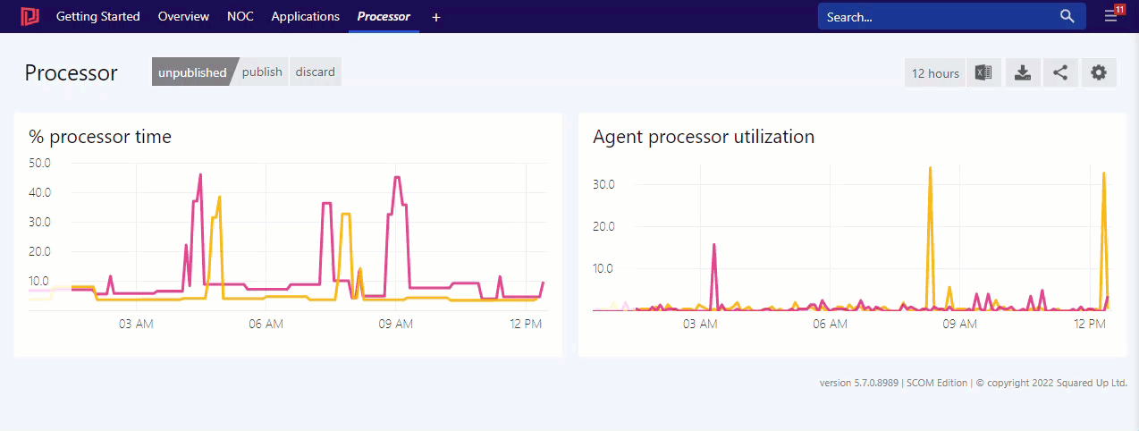
Configure the desired columns on the grid columns panel. As a best practise, once you know which columns you want to display, modify the Log Analytics query to only return those columns (via project or project away), as it will improve performance when loading and displaying the tile.
You can customize the appearance of columns by clicking the edit link next to it's name in the grid columns panel and then specifying a custom template. For example, locate the TimeGenerated column and set the template to {{timeago(value)}} to show a friendly time in the form Last x minutes rather than the specific time. For more information see How to use the Grid Designer.
VM Insights allows you to collect additional metrics called guest level metrics from your virtual machines (VMs).
You need to enable VM Insights in your Azure portal for each VM you want to monitor before you can show VM Insights data with the Azure Log Analytics tile.
You can find all information about enabling VM Insights in the Azure documentation.
Where to find KQL queries for showing VM Insights data
You can find useful queries by viewing VM Insights in your Azure portal. You'll see the underlying queries of Performance graphs when you edit them in Azure and can copy them from there. The Dependency Map shown in the Azure portal cannot currently be shown in SquaredUp DS.
InsightsMetrics
|where Namespace == "Processor"
|where Name == "UtilizationPercentage"
| summarize avg(Val) by Computer, bin(TimeGenerated, 5m)
For perspectives, you need to pull in the VM that is the focus of the perspective with {{scope[0].name}}:
InsightsMetrics
|where Computer startswith "{{scope[0].name}}"
|where Namespace == "Memory"
|where Name == "AvailableMB"
| summarize avg(Val) by Computer, bin(TimeGenerated, 5m)
The tile uses the query language KQL ("Kusto"). KQL is very rich and offers features such as sorting, projection and calculated values, which you can use to control the display of data in your dashboard.
You can use the clock insert time value button to insert page timeframe and date variables in your query.
Read about the timeframe panel below to see how a timeframe in the query interacts with the timeframe panel in the tile.
Check out our GitHub Samples repository for sample KQL queries from the community that can be used in Azure tiles.
For more information about writing KQL queries see this external Microsoft article.
Ensure that you have added the Reply URL to the Azure AD application, and that you have given Azure enough time to replicate the configuration (often takes several minutes).
Typically this indicates that a solution is missing from the queried workspace, resulting in it not containing the requested table (such as Update or UpdateSummary missing from workspaces without the Software Management solution enabled).


 One long list
 Column list
 Icons only


